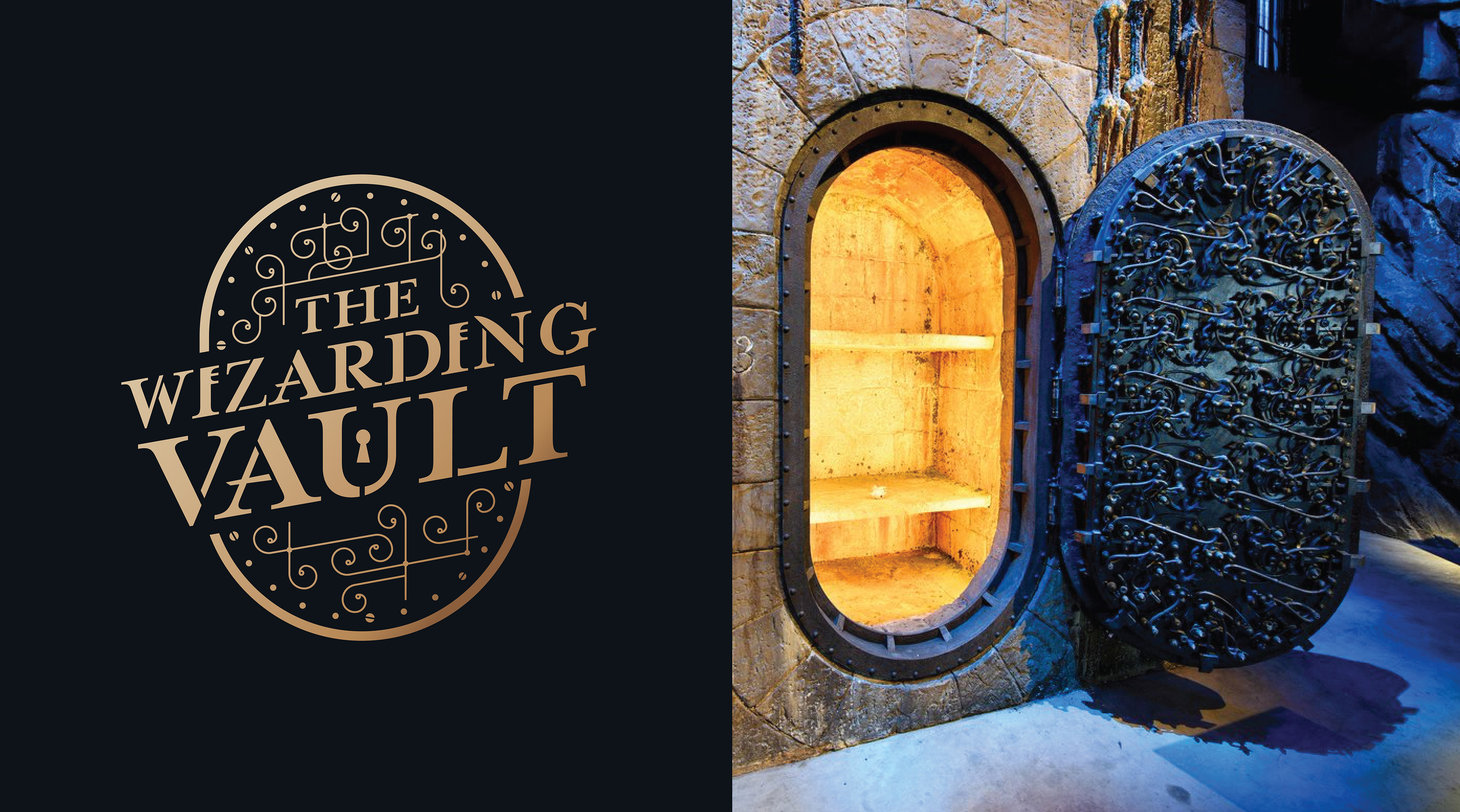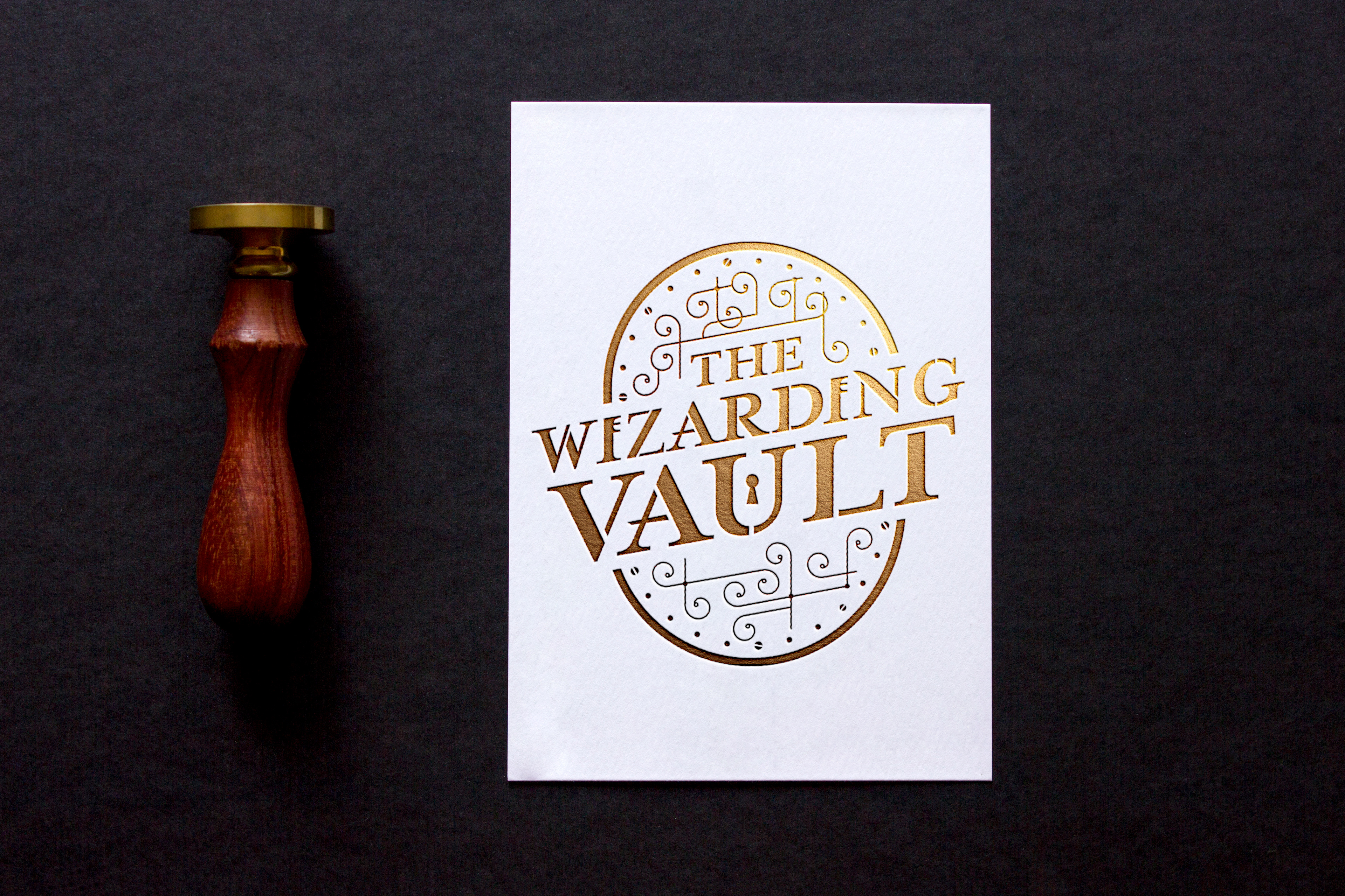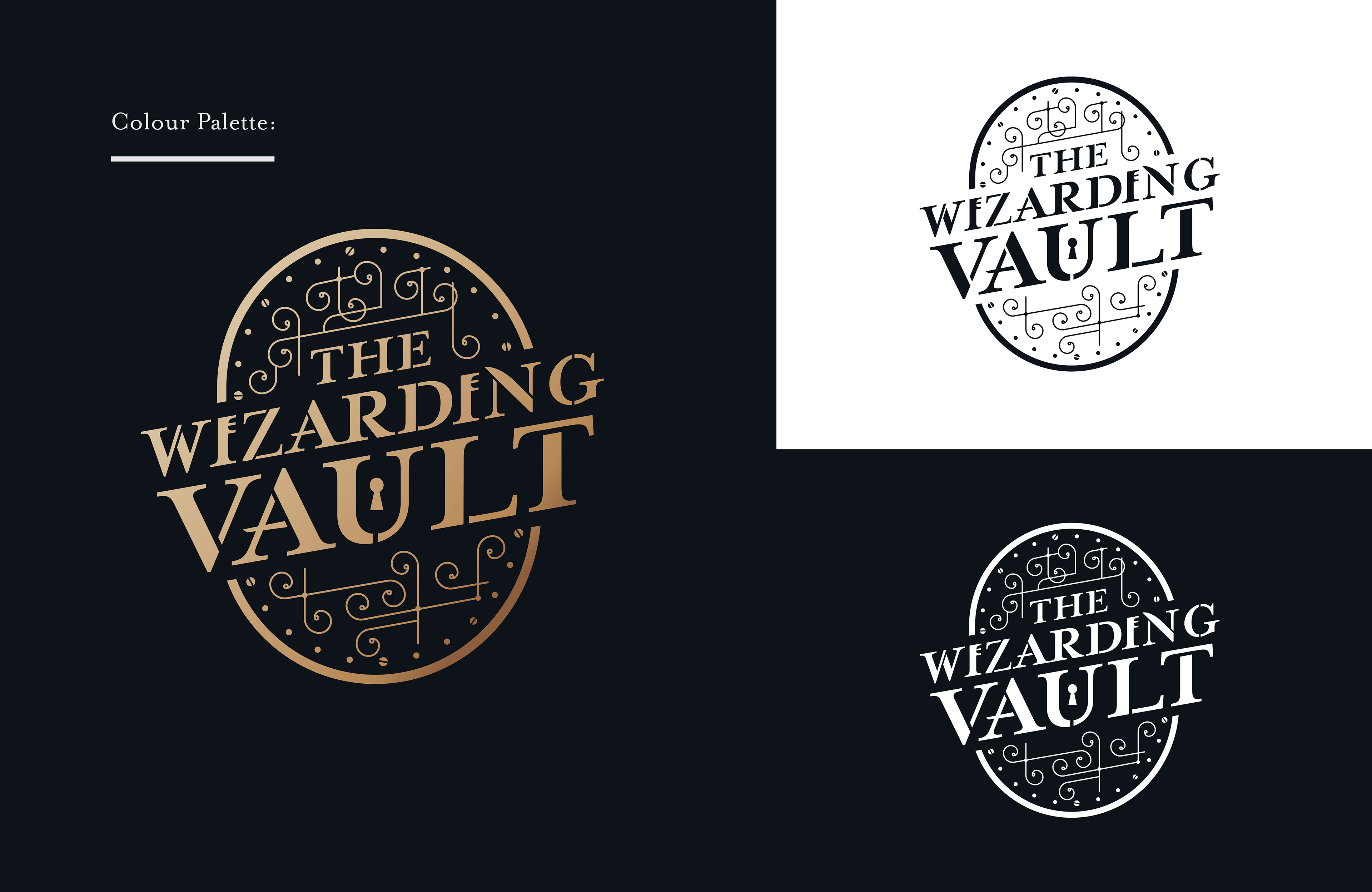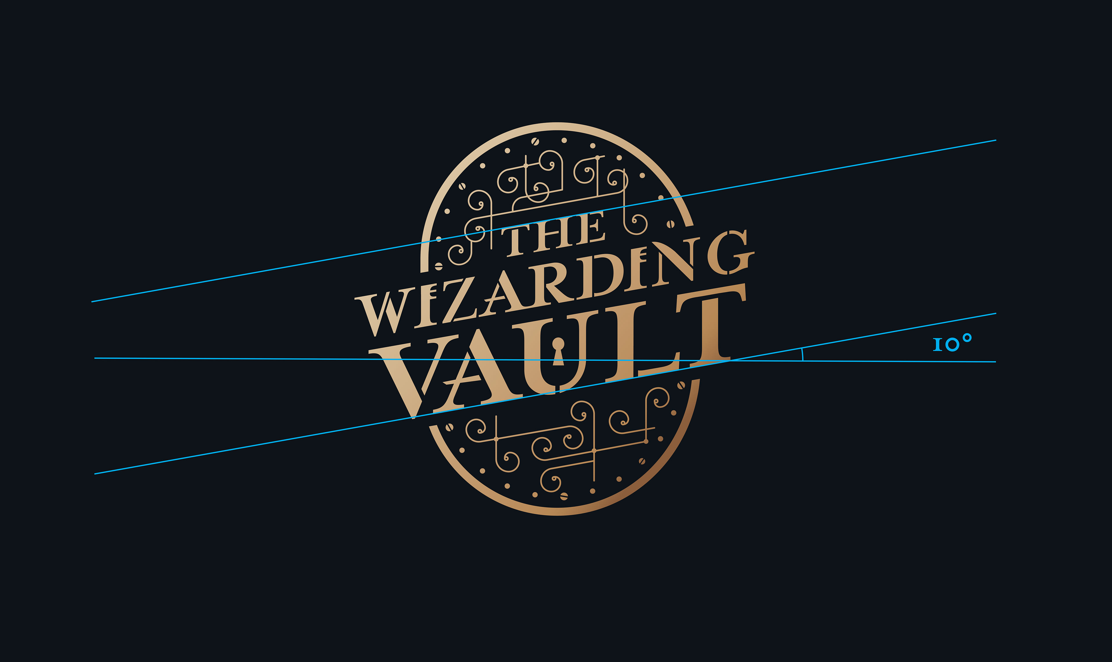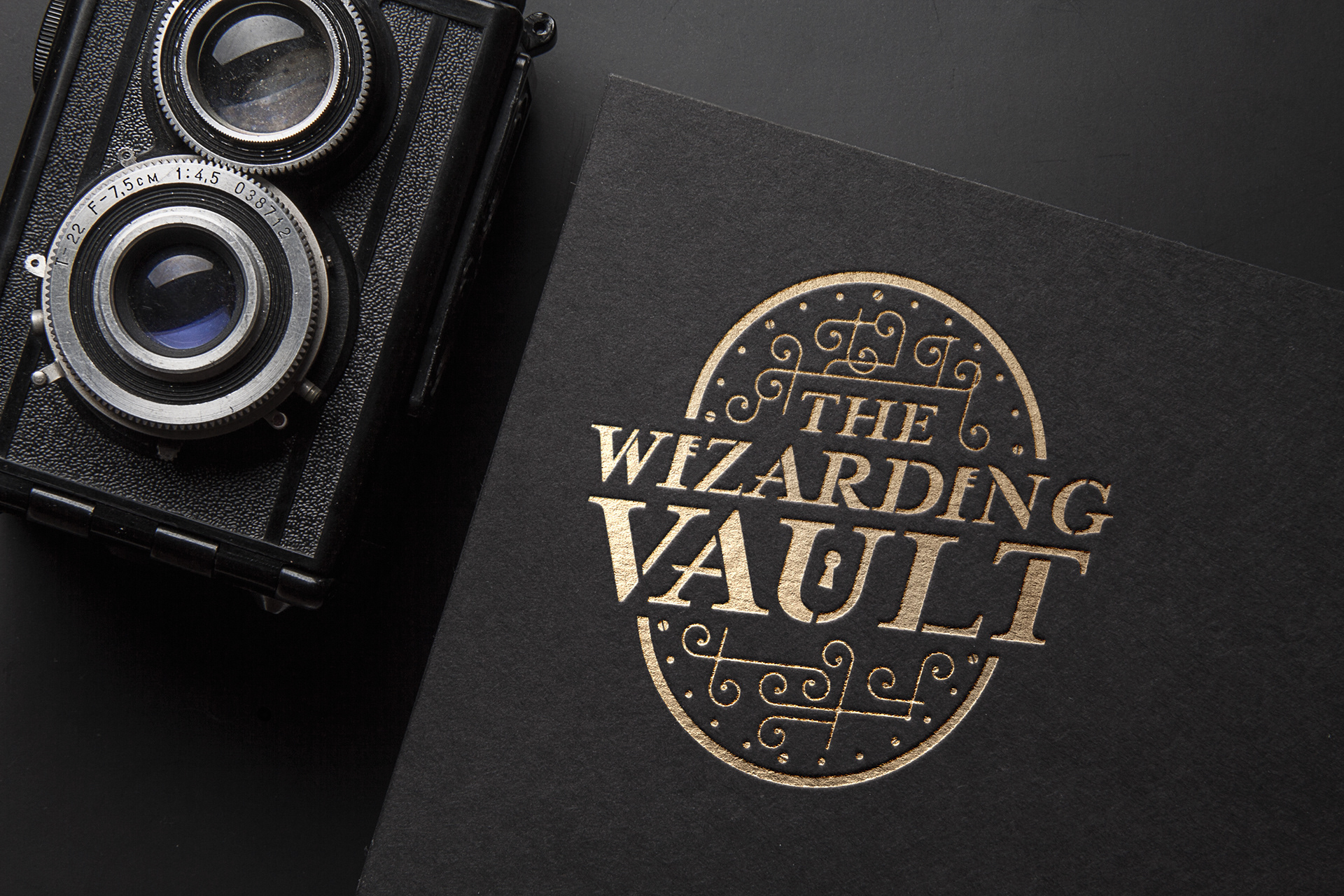
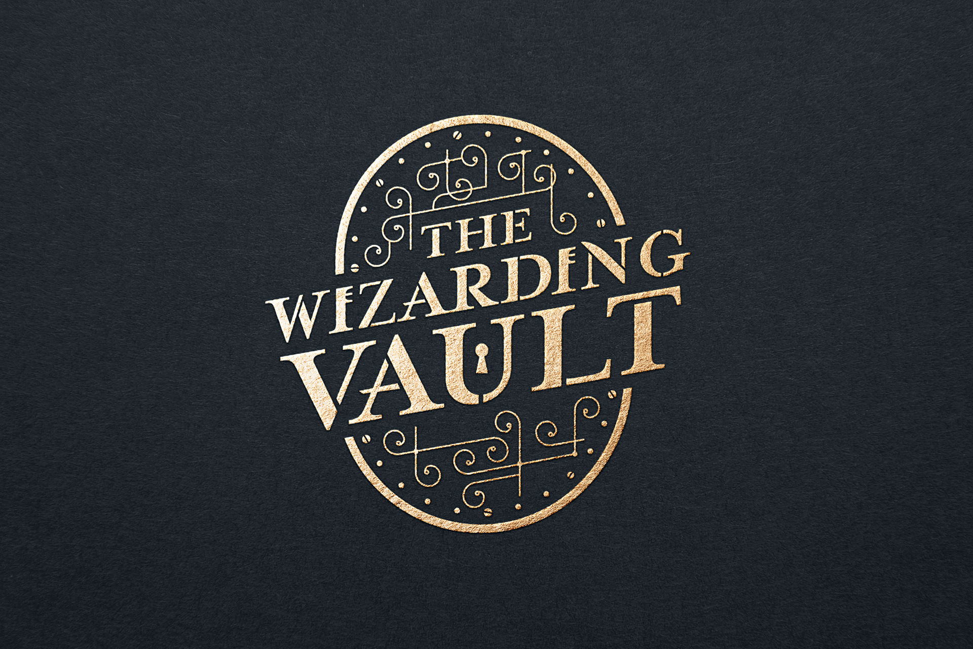
Branding created for Harry Potter blogger "The Wizarding Vault". It was important that the brand would fit in and belong within the wizarding world universe. A bank vault was the key visual direction for the logo, taking subtle characteristics and elements from the Gringotts Bank vault door which would feel familiar with Potter fans. The typography was also edited to make the "I"s resemble keys and a keyhole added within the "U" to continue the vault theme. Ornamentation and swirls from the mechanics of the Gringotts door was added to frame the typography.